PetPlate Design System
Contribution
UX/UI, Documentation
Timeline
2 months
Tools
Figma, ZeroHeight
Team
Larry Reynolds, Soyeon Kim, Matt Harlan, Ruby Baćanović
The Problem
With a recent budget increase, PetPlate had charted an ambitious roadmap, outlining numerous large-scale updates and projects for the year. Nonetheless, projections indicated that the current pace of design and engineering may hinder progress, potentially delaying established deadlines.
Impact
Velocity
Improved collaboration through tokens and documentation
Improved design sprint velocity by 65%
Usability
Increased SUS score by an average of 12%
Reduced dead clicks by an average of 16%
Objectives and Principles
Design Efficient
Building blocks that are versatile and intuitive to use.
Developer Friendly
Foundations and components that are technically feasible.
User Friendly
Improved usability and aesthetics that are parallel with branding.
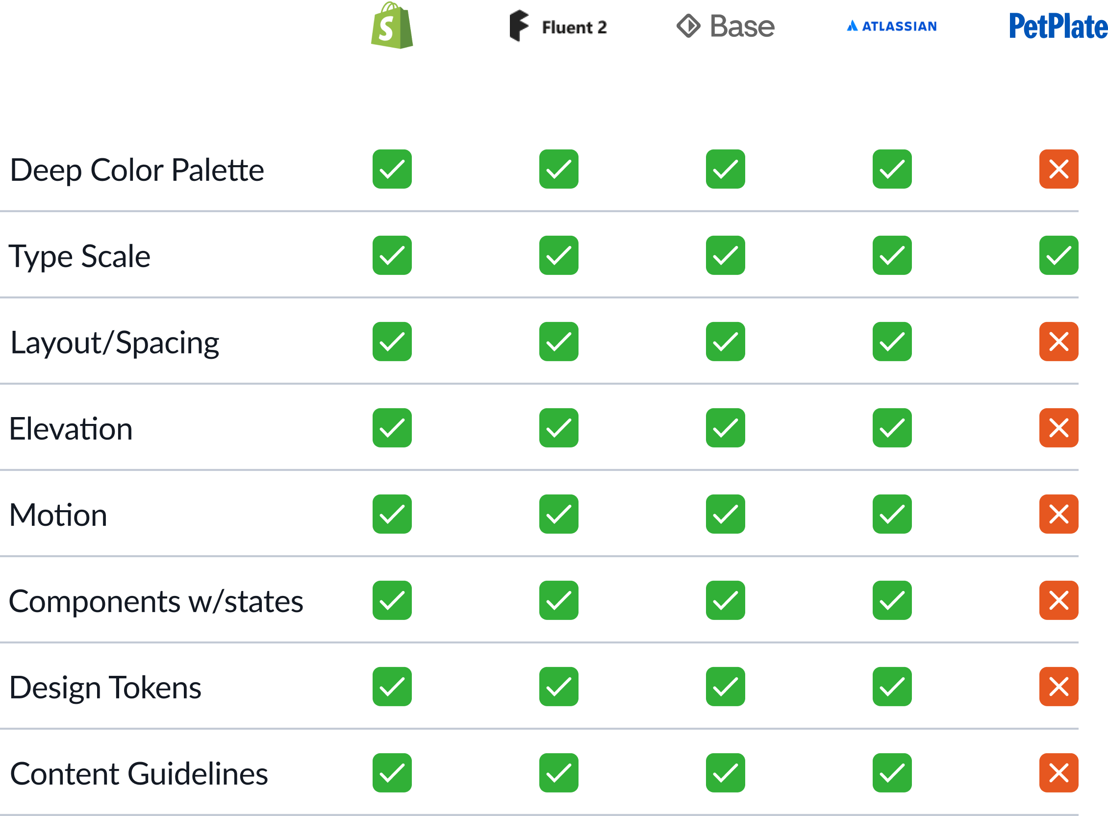
Competitive Analysis
We looked at design systems of industry leaders to understand their approach and what elements we were lacking.
Components and Blocks
We created adaptable building blocks that could accommodate for different use cases and states as opposed to having to build each one from scratch.
Size variants for desktop, tablet and mobile
Properties for quick component adjustments
Interactive documentation in ZeroHeight
Color Palette
We developed a brighter, more saturated color palette that represented the friendly and approachable nature of our brand. We also created neutrals for text content and supporting colors for statuses, error states, and edge cases.
Type Scale
We changed our body font from Caslon Doric to Lato, using a perfect fourth scale. This improved legibility and visual hierarchy.
New body type scale
Applied in a component
Layout and Spacing
We worked closely with developers to introduce a 4pt spacing system and a column grid system that aligned well with what was feasible in our CSS grid.
Visual Hierarchy
Applying all of these changes in color, type scale, spacing, and improved components resulted in improved visual hierarchy across the site.
Documentation
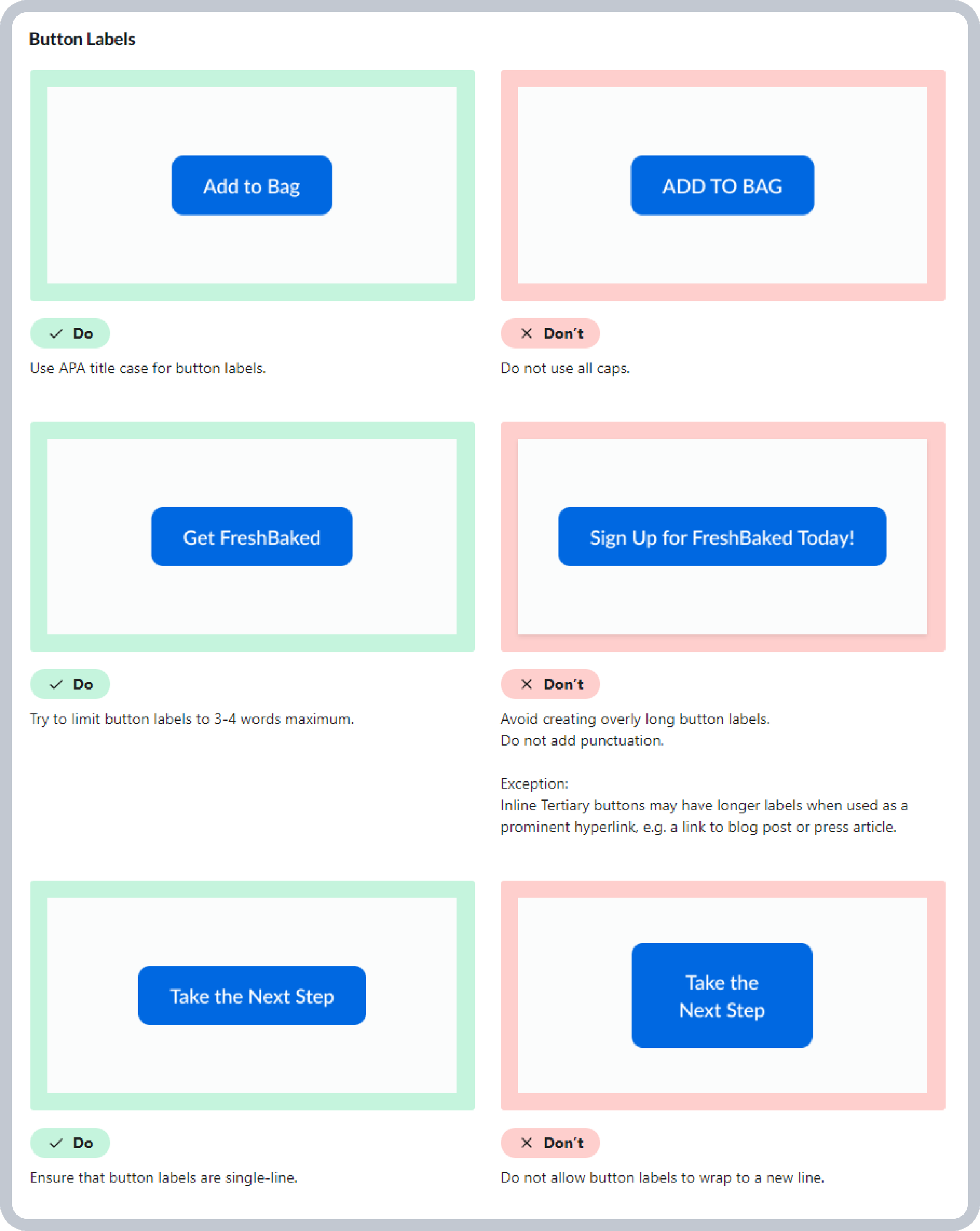
We documented our design system in ZeroHeight. This included all of our components as well as design tokens, usage guidelines, and design guidelines. This served as our source of truth and fostered efficient cross-functional communication. You can view it here.
Examples in Practice
Next Steps and Reflection
This was the first time I worked on building a design system from scratch. I learned much about visual design; especially from Larry Reynolds, who continuously mentored me throughout the process. Now that the project was complete, it was time to convert all of our existing designs and stress-test the system.


