PetPlate Account Experience
Redesigned to improve discoverability and usability.
Contribution
Product, UX/UI, Research
Timeline
12 weeks
Tools
Figma, UserTesting.com
Team
Soyeon Kim, Matt Harlan
Context
PetPlate is a health-conscious dog meal plan subscription service. Customers receive a tailored plan after taking a quiz upon sign-up. To view or modify their plan details, customers must access the account page which includes their subscription overview, order history, account settings, and loyalty club.
The Problem
The account experience is hard to navigate and features are difficult to use.
Customers were struggling to utilize existing account features such as changing their payment method or modifying their meal plans.
The business ask: PetPlate’s Customer Experience team is receiving an overwhelming number of inquiries regarding the account experience. This is severely limiting their bandwidth. I was asked to identify and address pain points to reduce this time and resource cost.
Solution Preview
This is the subscription overview page where customers can modify their meal plan details.
Impact
I measured number of inquiries, utilization, and general usability.
Identifying pain points
I worked closely with CX to understand what the most prominent issues were. Our customers struggled with information comprehension and navigation.
Design Approach
I worked with leadership and our engineering team to understand what was feasible given our constraints. Recognizing the extensive scope of the account experience, I chose to concentrate on a few key principles:
Responsive Use Cases
Working Memory
Discoverability
Consistency
Red Route Analysis
I used a red route approach for us to understand frequency of usage and how I should prioritize features.
How might we empower our users to navigate more efficiently?
I reduced the number of navigation items by grouping associated content and ordering them based on frequency of usage. I also opted to remove the global navbar from the account experience. Scanning the navigation menu now involved a lot less mental interaction cost.
DESIGN CONSIDERATION
Original IA
Simplified IA
Improved navigation menu for quicker scanning
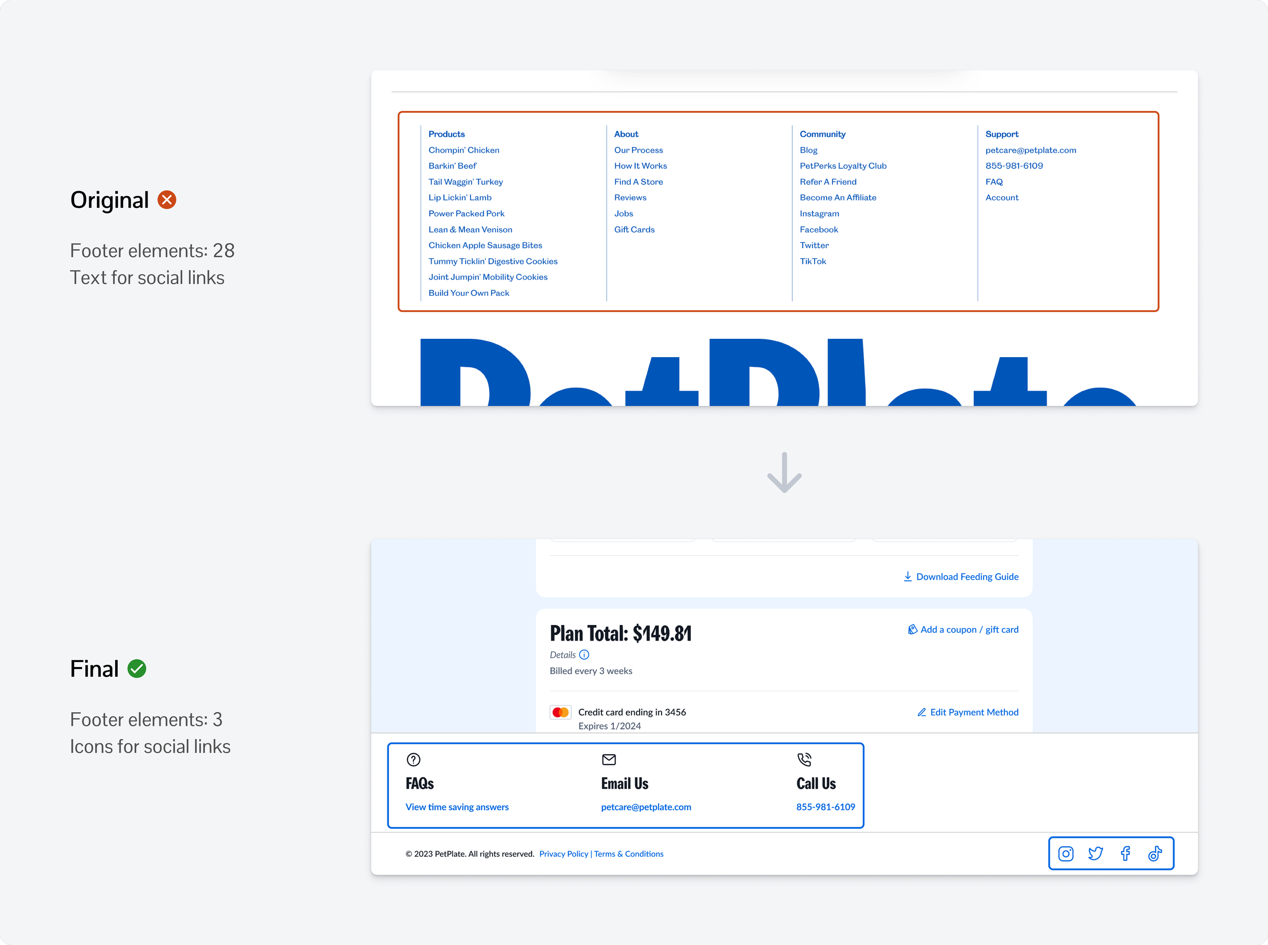
Prioritized prominent features for the footer and used icons over text for quicker scanning
How might we make information more digestible?
I applied the concept of chunking to group related information together, reducing cognitive load for users by limiting the number of options they need to process at a given time. I also used spacing and contrast to emphasize this segmentation of content. The sectioned information was ordered based on the red route analysis.
DESIGN CONSIDERATION
Visual and Content Hierarchy Improvements
Interaction Design Improvements
Wireframes
I created low-fidelity wireframes to help me visualize content grouping and placement. I translated finalized flows into high fidelity.
This wireframe represents one flow where a user logs in and modifies their dog’s information.
Visual Design Improvements
Our new design system brought a lot of visual design and hierarchy improvements to the experience. I have a separate case study that goes more in-depth.
Moderated User Study
To proactively validate our improvements I created a high-fidelity interactive prototype and conducted a moderated user study. The structure included:
Initial impressions
Task completion rate
Task completion time
How users felt about the experience
Direct Success: User completes the task.
Indirect Success: User requires help.
Failure: User is unable to complete the task.
Positive Feedback:
Visually more modern and clean
Feels more concise and direct
Easier to understand
Easier to find features and information
How was your experience completing the tasks?
Urgent Issues:
I identified 2 critical usability issues.
1. Users were missing that you have to click the dog’s name to proceed.
2. Users were getting confused with regards to what “Meals 21” means.
Unmoderated Study
I designed updates to directly address the usability problems and ran a quick unmoderated test to validate our solutions.
Final Prototype
These are a few of the features from our interactive prototype.
Edit your subscription details.
View orders and reschedule your next delivery.
View the invoice for your most recent order.
Adjust your account settings.
Learnings/Reflection
Impact of strong visual and interaction design
When to validate assumptions and what format to use
Breaking up large-scope problems into sub-projects
Next Steps
Hand-off finalized designs and design specs to developers
Monitor success metrics
Document qualitative data and explore other opportunities


